
4. Pandas DataFrames and Data Visualization#
Learning Objectives
Be able to aggregate pandas data using .groupby()
Be able to find the .mean() or .count() the number of items in aggregated data
Be able to groupby multiple columns and .unstack() as needed.
Be able to represent data in bar and pie charts using either pandas or matplotlib. See matplotlib’s cheatsheets and handouts as well as tutorials
4.1. pandas.DataFrame.goupby()#
4.1.1. Reading Data#
You will need titanic.csv data file for this lesson.
An aside
Many datasets can be found on line for analysis to practice data science methods. These can be found from a simple google search and include such sites as: data science dojo or openml
import numpy as np
import matplotlib.pyplot as plt
import pandas as pd
plt.style.use('seaborn-colorblind') #high contrast color palette
If you downloaded the titanic.csv file to your computer, you can use the following to read the file.
import os
path = r'C:\Users\Sean\Downloads\data' #change to your path
filename='titanic.csv'
fullpath=os.path.join(path,filename)
raw=pd.read_csv(fullpath)
Below, we are going to directly read the file from my google drive. The 1ELCvnr0WjQcglNlmxhqzsAOK8DnPaHW_ is the file id assigned by google for this file. Other formats are listed in the Appendix: 3114 Data Files
# This is a direct read of the titanic file from my google drive.
raw=pd.read_csv('https://drive.google.com/uc?id=1ELCvnr0WjQcglNlmxhqzsAOK8DnPaHW_')
raw.head(3) #looking at only first 3 records
| PassengerId | Survived | Pclass | Name | Sex | Age | SibSp | Parch | Ticket | Fare | Cabin | Embarked | |
|---|---|---|---|---|---|---|---|---|---|---|---|---|
| 0 | 1 | 0 | 3 | Braund, Mr. Owen Harris | male | 22.0 | 1 | 0 | A/5 21171 | 7.2500 | NaN | S |
| 1 | 2 | 1 | 1 | Cumings, Mrs. John Bradley (Florence Briggs Th... | female | 38.0 | 1 | 0 | PC 17599 | 71.2833 | C85 | C |
| 2 | 3 | 1 | 3 | Heikkinen, Miss. Laina | female | 26.0 | 0 | 0 | STON/O2. 3101282 | 7.9250 | NaN | S |
Slicing DataFrames using .loc and .iloc
Let’s take a subset of our data to inlcude the columns: ‘Survived’, ‘Pclass’,‘Sex’,‘Age’, and ‘Fare’
data=raw.loc[:,['Survived', 'Pclass','Sex','Age','Fare']]
print(f"We have {data.shape[0]} records.  Here are the first 5.")
data.head()
We have 891 records. Here are the first 5.
| Survived | Pclass | Sex | Age | Fare | |
|---|---|---|---|---|---|
| 0 | 0 | 3 | male | 22.0 | 7.2500 |
| 1 | 1 | 1 | female | 38.0 | 71.2833 |
| 2 | 1 | 3 | female | 26.0 | 7.9250 |
| 3 | 1 | 1 | female | 35.0 | 53.1000 |
| 4 | 0 | 3 | male | 35.0 | 8.0500 |
Note
This would be a good place to test the code above as outlined in Problem 1. Notice the use of the f-string and the syntax {data.shape[0]}. What’s happening here? Why are we using curly braces? What does .shape do? and why did we use .shape[0] and not .shape or .shape[1]?
4.1.2. groupby 1 column#
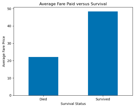
Let’s find the average ticket price paid for those that died and those that survived? We can accomplish this by grouping by the column ‘Survived.’ This will aggregate all the data according to whether the value in this column is a 0 (died) or a 1 (survived). Then we just tell pandas what to do with this aggregated data. In our case, we want the mean.
data.groupby('Survived').mean()
| Pclass | Age | Fare | |
|---|---|---|---|
| Survived | |||
| 0 | 2.531876 | 30.626179 | 22.117887 |
| 1 | 1.950292 | 28.343690 | 48.395408 |
You can see this gives us the mean value of Pclass, Age, and Fare for all those with a 0 (died) or 1 (survived) in the Survived column. The column values (0 or 1) have now been set as the row index.
Something to try
What do you expect to get if you grouped by ‘Pclass’ rather than ‘Survived’ i.e. data.groupby('Pclass').mean() ? Think about it first and then try it and see. The mean values given for ‘Survived’ is quite interesting. How would you interpret these results?
Let’s get the mean Fare price for those that died and survived and present those results as a bar plot.
df=data.groupby('Survived').mean()

dataforbar=df.loc[:,'Fare']  #all rows (:), column 'Fare'

labels = ['Died','Survived']

# the following code might be useful for your cheatsheet
fig1, ax1 = plt.subplots()
dataforbar.plot.bar(ax=ax1, rot=0) #notice format here for bar plots  dataframe.plot.bar(ax= , rot=0)
ax1.set_xticklabels(labels) # if not used, you will get the labels that are in the dataframe which is often fine
ax1.set_xlabel('Survival Status') # will default to column label of dataframe if not used
ax1.set_ylabel('Average Fare Price')
ax1.set_title('Average Fare Paid versus Survival')
plt.show()
Something to try
Group by ‘Pclass’, df=data.groupby('Pclass').mean() and make a barchart for the data in column ‘Survived’, dataforbar=df.loc[:,'Survived']. How would you interpret these results for example, which class had the lowest survival rate?
4.1.3. groupby 2 columns#
What is the average age of male and female passengers in 1st, 2nd, and 3rd class? To answer this we want to know about a feature “average age” broken out by two other features “Sex” and “Pclass.” For this, we will groupby both Sex and Pclass.
data.groupby(['Sex','Pclass']).mean().unstack().loc[:,'Age']
| Pclass | 1 | 2 | 3 |
|---|---|---|---|
| Sex | |||
| female | 34.611765 | 28.722973 | 21.750000 |
| male | 41.281386 | 30.740707 | 26.507589 |
Wow, we did this all in one step. When you see code with multiple steps in one line like this, you should break it down to better understand what each command is doing. We have already seen the first two .groupby() and .mean(). So let’s start there:
data.groupby(['Sex','Pclass']).mean()
| Survived | Age | Fare | ||
|---|---|---|---|---|
| Sex | Pclass | |||
| female | 1 | 0.968085 | 34.611765 | 106.125798 |
| 2 | 0.921053 | 28.722973 | 21.970121 | |
| 3 | 0.500000 | 21.750000 | 16.118810 | |
| male | 1 | 0.368852 | 41.281386 | 67.226127 |
| 2 | 0.157407 | 30.740707 | 19.741782 | |
| 3 | 0.135447 | 26.507589 | 12.661633 |
All the information we need is given in the column “Age.” We could get this by slicing on that column:
data.groupby(['Sex','Pclass']).mean().loc[:,"Age"]
Sex     Pclass
female  1         34.611765
        2         28.722973
        3         21.750000
male    1         41.281386
        2         30.740707
        3         26.507589
Name: Age, dtype: float64
In this form, we get one column of data with 2 indices for each row. I can see this if I ask for the index of this data:
data.groupby(['Sex','Pclass']).mean().loc[:,"Age"].index
MultiIndex([('female', 1),
            ('female', 2),
            ('female', 3),
            (  'male', 1),
            (  'male', 2),
            (  'male', 3)],
           names=['Sex', 'Pclass'])
If I wanted the average age of female passengers in 2nd class (‘female’,2) I would just use .loc again with these two indices including the “( )”.
data.groupby(['Sex','Pclass']).mean().loc[:,"Age"].loc[('female',2)]
28.722972972972972
What is the .unstack() for? This reduces the number of indices by moving the second indice “Pclass” back to the columns.
data.groupby(['Sex','Pclass']).mean().unstack()
| Survived | Age | Fare | |||||||
|---|---|---|---|---|---|---|---|---|---|
| Pclass | 1 | 2 | 3 | 1 | 2 | 3 | 1 | 2 | 3 |
| Sex | |||||||||
| female | 0.968085 | 0.921053 | 0.500000 | 34.611765 | 28.722973 | 21.750000 | 106.125798 | 21.970121 | 16.118810 |
| male | 0.368852 | 0.157407 | 0.135447 | 41.281386 | 30.740707 | 26.507589 | 67.226127 | 19.741782 | 12.661633 |
…and now we can grab the “Age” data using .loc[:,"Age"]
data.groupby(['Sex','Pclass']).mean().unstack().loc[:,'Age']
| Pclass | 1 | 2 | 3 |
|---|---|---|---|
| Sex | |||
| female | 34.611765 | 28.722973 | 21.750000 |
| male | 41.281386 | 30.740707 | 26.507589 |
Compare this to the results we got above without the .unstack() and printed out again below for your convenience.
data.groupby(['Sex','Pclass']).mean().loc[:,'Age']
Sex     Pclass
female  1         34.611765
        2         28.722973
        3         21.750000
male    1         41.281386
        2         30.740707
        3         26.507589
Name: Age, dtype: float64
You can see this is the same data but the former gives a DataFrame back rather than a Series and it is easier to read and use. Let’s make a bar chart of our unstacked result. This data is the average age by ‘Sex’ and ‘Pclass’. We will put the Pclass on the x-axis and plot a bar for each Sex (male or female) with a height given by the average Age (y-axis).
Important
Don’t use the code in the next cell. I’m showing it to you so you can see how much easier it is to use pandas plotting rather than matplotlib.
dataforbar=data.groupby(['Sex','Pclass']).mean().unstack().loc[:,'Age']

labels = ['1st','2nd','3rd'] #for x-axis
x = np.arange(len(labels))  # the label locations
width = 0.35  # the width of the bars

fig1, ax1 = plt.subplots()
ax1.bar(x-width/2, dataforbar.loc['female'], label='female',width=width)
ax1.bar(x+width/2, dataforbar.loc['male'], label='male',width=width)

# Add some text for labels, title and custom x-axis tick labels, etc.
ax1.set_ylabel('Average Age')
ax1.set_title('Average Age of passengers versus Ticket Class')
ax1.set_xticks(x)
ax1.set_xticklabels(labels)
ax1.legend()

plt.show()
We did quite a bit of work above with matplotlib (i.e. plt) to get the bar chart to work out. Since pandas specializes in working with DataFrames, we can use pandas to plot rather than matplotlib. The code (below) is much easier. In fact, pandas uses matplotlib to plot but has its own plot functions designed to work with dataframes.
dataforbar=data.groupby(['Sex','Pclass']).mean().unstack().loc[:,'Age']

fig1, ax0 = plt.subplots()
dataforbar.plot.bar(ax=ax0,rot=0) # again notice that the axis name, ax0, goes inside the bar() function
ax0.set_ylabel("Average Age")
ax0.set_title('Average Age of passengers versus Ticket Class')

plt.show()
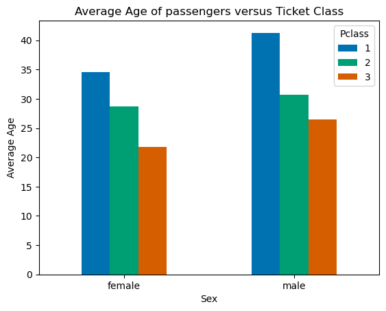
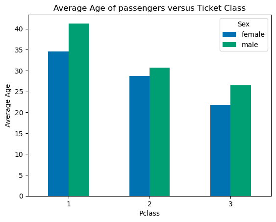
Wow! That was much easier but notice that didn’t get back exactly the same plot. Notice the x-axis and legend are reversed comparing the two plots. We can fix this easily by reversing the order of our groupby command from .groupby(['Sex','Pclass']) to .groupby(['Pclass', 'Sex']).
dataforbar=data.groupby(['Pclass','Sex']).mean().unstack().loc[:,'Age']

fig2, ax2 = plt.subplots()
dataforbar.plot.bar(ax=ax2, rot=0)
ax2.set_ylabel('Average Age')
ax2.set_title('Average Age of passengers versus Ticket Class')

plt.show()
Important
In general, the number of unstack() functions we apply is one less than the number of columns we used in our groupby() so if we perform a 3 column groupby we will apply two unstack functions.
Basic Forms
Basic format for finding the average of columns:
By one column: data.groupby().mean()
By two columns: data.groupby().mean().unstack()
By three columns: data.groupby().mean().unstack().unstack()
etc…
Basic format for counting the number of items in columns:
By one column: data.groupby().count()
By two columns: data.groupby().count().unstack()
By three columns: data.groupby().count().unstack().unstack()
etc…
4.1.4. groupby 3 columns#
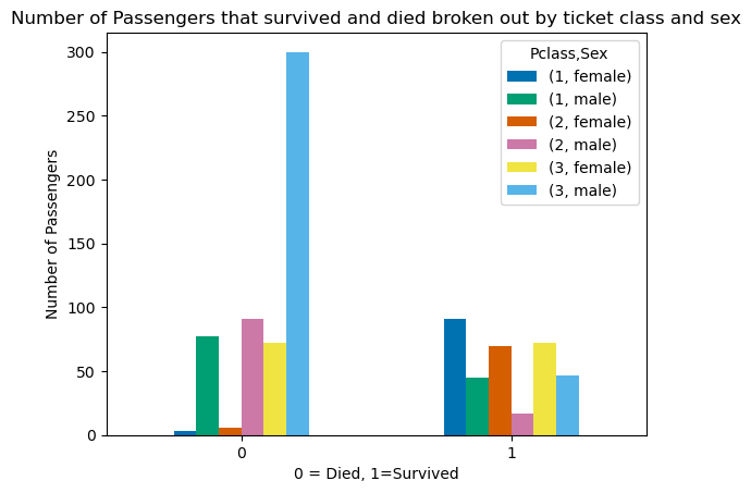
What is the number of male and female passengers vs ticket class that died vs survived? To answer this question, we want to know about a feature “number of passengers” broken out by three other features “Sex”, “Pclass”, and “Survived.” For this, we will groupby all three columns and use .count() rather than .mean() and we will use .unstack() twice. We are also grabbing the count on the “Fare” data since this is complete while some records don’t have an age recorded.
data.groupby(['Survived','Sex','Pclass']).count().unstack().unstack().loc[:,"Fare"]
| Pclass | 1 | 2 | 3 | |||
|---|---|---|---|---|---|---|
| Sex | female | male | female | male | female | male |
| Survived | ||||||
| 0 | 3 | 77 | 6 | 91 | 72 | 300 |
| 1 | 91 | 45 | 70 | 17 | 72 | 47 |
dataforbar=data.groupby(['Survived','Sex','Pclass']).count().unstack().unstack().loc[:,'Fare']

figure, axes = plt.subplots()
dataforbar.plot.bar(ax=axes,rot=0)
axes.set_ylabel("Number of Passengers")
axes.set_title('Number of Passengers that survived and died broken out by ticket class and sex')
axes.set_xlabel("0 = Died, 1=Survived")
plt.show()
Try this…
Replot the above but only using one .unstack() rather than two. Notice how the labels and plot change relative to the groupby order: ‘Survived’,‘Sex’,‘Pclass’. The last column in this list, ‘Pclass’ becomes the legend. The x-axis contains combinations of the first two, ‘Survived’ and ‘Sex’ with ‘Survived’ being ordered first so we get (died, female), (died,male), (survived, female), and (survived, male).
A pie chart might be a good way to represent our data. See the pandas documentation for more information and examples of the pie chart.
dataforpie=data.groupby(['Survived','Sex','Pclass']).count().unstack().unstack().loc[:,'Fare']
dataforpie
| Pclass | 1 | 2 | 3 | |||
|---|---|---|---|---|---|---|
| Sex | female | male | female | male | female | male |
| Survived | ||||||
| 0 | 3 | 77 | 6 | 91 | 72 | 300 |
| 1 | 91 | 45 | 70 | 17 | 72 | 47 |
The pie chart uses only 1 column of data but the data we want to plot is represented above in rows so let’s exchange the x and y axes i.e., transpose the DataFrame.
dataforpie.transpose()
| Survived | 0 | 1 | |
|---|---|---|---|
| Pclass | Sex | ||
| 1 | female | 3 | 91 |
| male | 77 | 45 | |
| 2 | female | 6 | 70 |
| male | 91 | 17 | |
| 3 | female | 72 | 72 |
| male | 300 | 47 |
We also could have changed the order of the groupby and used only one unstack to get the same data form.
data.groupby(['Pclass','Sex','Survived']).count().unstack().loc[:,'Fare']
| Survived | 0 | 1 | |
|---|---|---|---|
| Pclass | Sex | ||
| 1 | female | 3 | 91 |
| male | 77 | 45 | |
| 2 | female | 6 | 70 |
| male | 91 | 17 | |
| 3 | female | 72 | 72 |
| male | 300 | 47 |
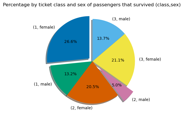
Now we can make a pie chart on the percentages of various classes of people that died (0) or survived (1). Let’s look at those that survived.
4.1.4.1. Using pandas plot:#
dataforpie=data.groupby(['Pclass','Sex','Survived']).count().unstack().loc[:,'Fare']
fig1, ax0 = plt.subplots()
dataforpie.plot.pie(ax=ax0, y=1) # y = column_index "1" is the second column = survived
plt.show()
Adding some formatting changes:
fig2, ax2 = plt.subplots()

dataforpie.plot.pie(ax=ax2, y=1, autopct='%.1f%%',shadow=True, startangle=90, explode = (0.1, 0, 0, 0.2,0,0), legend=False, ylabel='')
ax2.set_title('Percentage by ticket class and sex of passengers that survived (class,sex) ')
plt.show()
4.2. Exercises#
4.2.1. Problem 1#
Previously in this lesson we had the code:
data=raw.loc[:,['Survived', 'Pclass','Sex','Age','Fare']]
print(f"We have {data.shape[0]} records.  Here are the first 5.")
data.head()
Notice the use of the f-string and the syntax {data.shape[0]}. When you see code that is unfamiliar you should stop and test the coding to see what is going on. For example here, we might ask: Why are we using curly braces? What does .shape do? and why did we put [0] after it?
Answer/Do the following:
a. Remove the “f” in the print command and re-run. What do you get?
b. Replace {data.shape[0]} with {data.shape[1]}. Now fix the word “records” in this statement so that the sentence makes sense.
c. What does data.shape give you?
d. Replace data.head() with data.head(2) and data.head(5). How does this compare to data.head()?
4.2.2. Problem 2#
Group the titanic data see section: groupby 1 column by ‘Pclass’, df=data.groupby('Pclass').mean() and make a barchart for the data ‘Survived’, dataforbar=df.loc[:,'Survived']. How would you interpret these results for example, which class had the lowest survival rate?
4.2.3. Problem 3#
2 column groupby: Make a bar chart showing the average ticket price for 1st, second, and third class passengers broken out by sex. For this problem, put Pclass on the x-axis and plot a bar for each Sex (male or female) with a height equal to the average ticket price (y-axis).
4.2.4. Problem 4#
a. Re-plot the example in “groupby 3 columns” but now only using one .unstack() rather than two. Notice how the labels and plot change relative to the groupby order: ‘Survived’,‘Sex’,‘Pclass’. The last column in this list, ‘Pclass’ becomes the legend. The x-axis contains combinations of the first two, ‘Survived’ and ‘Sex’ with ‘Survived’ being ordered first so we get (died, female), (died,male), (survived, female), and (survived, male). Make sure you include an appropriate title and y-label.
b. Now change the order of the groupby columns to: [‘Sex’,‘Pclass’,‘Survived’] and replot again using only one unstack(). Comment on how the order of the groupby corresponds to changes in your x-axis and legend.
4.2.5. Problem 5#
Using pandas, make a pie chart showing the percentage of passengers that died on the titanic broken out by sex and ticket class. Your pie chart should have 6 pieces: (1st class, female), (1st class, male)… (3rd class, male). Explode only the pie piece for (2nd class,male) by 0.25. Remove both the legend and y-label. Make sure you correct the title.